Cottrell Hall adds much to campus, but its furniture lacks in practicality

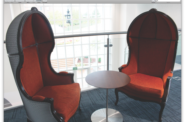
Cottrell Hall study space from the loft of Starbucks. Photo by: Lona Williams
By Anne Davey // Opinion Editor
At this point in the semester, High Point University students, faculty and staff have grown accustomed to campus’ newest addition: Cottrell Hall. The 43,000-square-foot, two story building cost $23 million. The building is already a hub of student activity and a new favorite study spot. As a student center and the home of nearly all student services on campus, it is heavily trafficked and highly popular by design. It is home to Starbucks, an international student concourse, career and professional development offices, entrepreneurship centers and a bevy of study spaces.
Each year HPU students return to find tremendous additions to campus; new dorms, amphitheaters, dining locations and office space are some of the highlights of this year’s additions. Cottrell Hall is by far the most exciting new addition to campus this year—but what people were most excited about was to finally have more study spaces.
While Cottrell Hall is stunning, and undeniably a tremendous addition to campus, it is highlights some reoccurring issues that surface when HPU builds, or renovates, facilities. The spaces are always stunning, but often highly impractical. The new furniture in Cottrell is similar to the furniture placed in Slane Student Center during its most recent makeover–highly showy, very futuristic, and unfortunately impractical. Instead of maximizing the space and combining utility with design and comfort, the end result is lacking.
The building has several glass conference rooms, equipped with long tables and office style desk chairs; these rooms are constantly in demand, and rarely every open. However the rest of the study spaces, the individual “creative rooms” and the second floor “Creative Commons” are stocked with furniture so impractical, uncomfortable and not conducive to studying that it is frustrating. The majority of the room is just chairs and couches, set up to look like study spaces, but without a desk or table to actually make this feasible. There are few desks, and what desks there are include high top, bar style counter spaces with stools instead of chairs.
“I need a table to study, but the board rooms are always taken and there’s really no other good spot to study,” Lexie Williamsm junior, said. “The big room with all of the furniture is cool just not productive.”
The individual study rooms have high top tables and low backed bar height stools—nearly impossible to get comfortable in or be productive in academically. The “Study spaces” and “common areas” of the building, are riddled with futuristic, sleek looking, eye catching furniture.
“I think pretty much all of the furniture is tacky and going to be out of style in just a few years and need to be refurnished because they are so modern on top of being uncomfortable” Ceili Lang, sophomore, said.
While this furniture may be ascetically pleasing, it is not practical in the slightest.
“I do not particularly care for the furniture in the loft over Starbucks, I don’t think it looks very welcoming or well put together,” Cassidy Cunningham, junior, said. “However I love the desks in the big rooms and the conference rooms that can be used for studying–I just wish there were more. I also really like how Starbucks is laid out and the lighting in all of the study rooms.”
While Cottrell Hall is a big hit on campus, the student body’s feedback all generally echoes the sentiment that the furniture is impractical and that there needs to be more focus on making the spaces not just aesthetically pleasing, but useful. The building does feature many great additions, such as white board study spaces and additional student service facilities, but it is evident that the decorators didn’t stop to consider the actual functionality of the spaces they were filling.